NAR's New Affordability Score: Most Investors Are Reading It Backwards
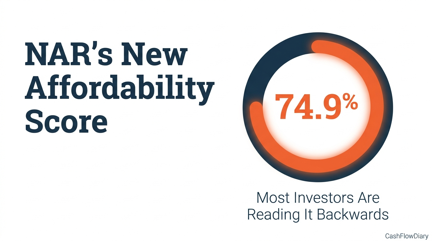
The National Association of REALTORS® and Realtor.com dropped a new affordability metric on May 20, 2026. Within 90 days, every real estate blog in the country will write a version of the same headline: "Housing access at 74.9% of balanced market." That headline misses the entire point.
The metric tells you the maximum dollar amount you could spend if you had no judgment of your own. No one should spend the maximum dollar amount.
That distinction is the difference between a useful market-selection tool and a number you mistake for a decision.
What the Listing-Income Alignment Score Actually Measures
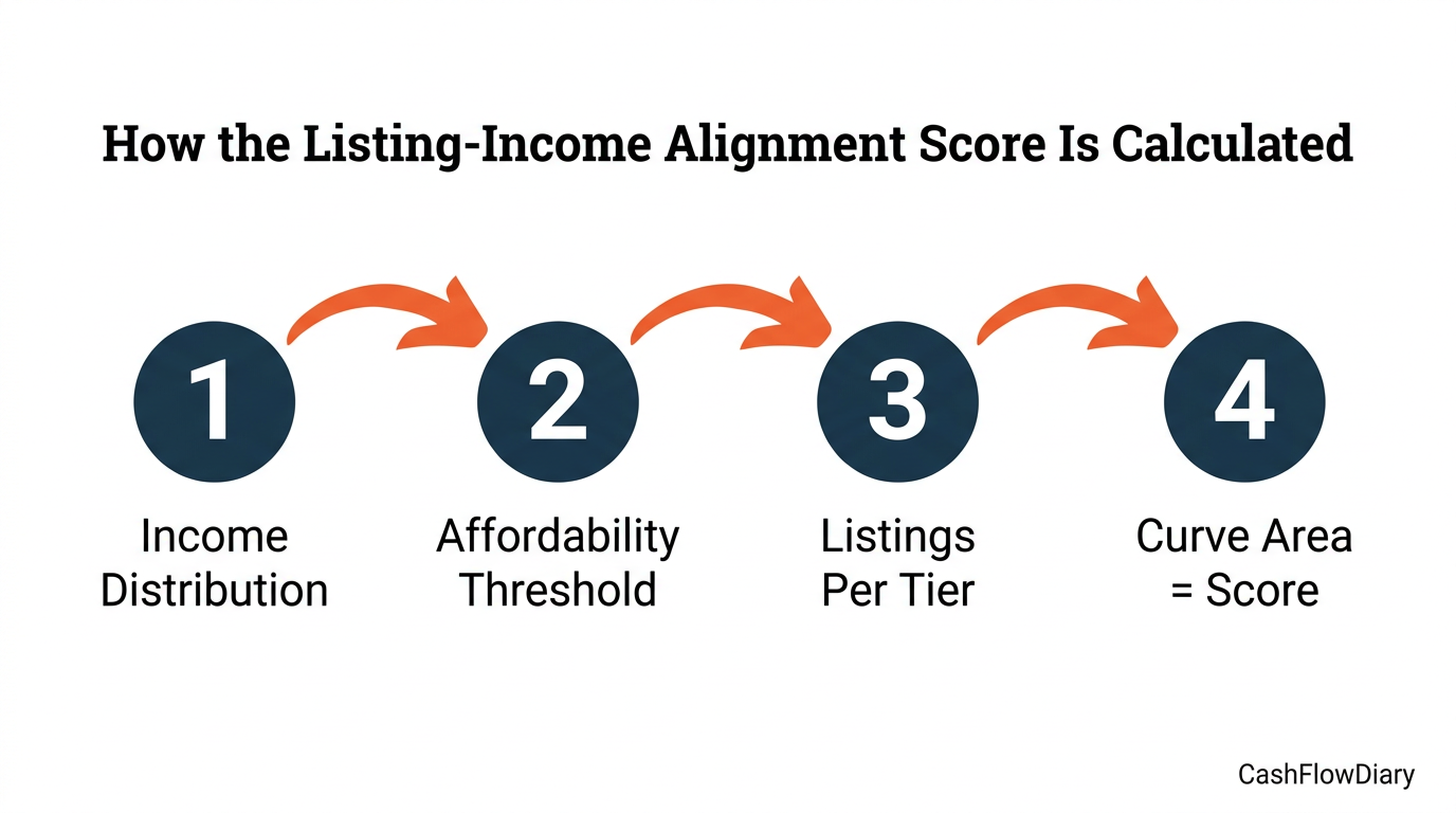
The Listing-Income Alignment Score is a single percentage between 0 and roughly 200% that compares the price distribution of homes currently for sale to the income distribution of households in a given market. A score of 100% means listings are distributed proportionally across all income levels — for every income tier, there are as many affordable homes for sale as there are households who could afford them.
The national score sits at 74.9% as of March 2026, up from 66.7% a year earlier but still well below the pre-pandemic baseline of 84.4%. The trough was 57.4% in March 2023.
The methodology has four inputs:
1. Household income distribution by market (sourced from Nielsen)
2. Active listings and their prices (sourced from Realtor.com)
3. A per-tier affordability threshold that calculates the maximum home price each income bracket can buy, assuming 30% of income covers principal + interest + property tax + insurance, a 30-year fixed-rate mortgage at the prevailing rate, and a variable down payment from Optimal Blue origination data
4. The area under the affordability curve — for each income percentile, the share of listings priced at or below that bracket's affordability threshold, plotted against the percentile, then doubled to produce a score between 0 and 200 on the original scale (or 0 and 200% on the new scale)
A worked example NAR uses: in the United States, households earning under $75,000 can afford a home priced up to about $261,140. Listings at or below that price point account for only 23% of national inventory — compared to 44% in a balanced market. That single income bracket is short approximately 311,000 affordable homes.
This methodology is not new. NAR introduced the Realtors® Affordability Distribution Curve and Score in 2017. The 2026 release is the same calculation rebranded from a 0-to-2 scale (where 1.0 = balanced) to a 0-to-100%+ percentage (where 100% = balanced). NAR multiplied the old score by 50 and gave it a friendlier name. The full methodology lives in the 2022 NAR/Realtor.com report The "Double Trouble" of the Housing Market (PDF), which contains the original four-step formula in detail along with historical income-bracket data going back to 2019.
That nine-year continuity matters. Coverage of this week's release is going to treat the metric as if it appeared from nowhere. It didn't. Here is the trajectory through one consistent methodology:
| Date | Score (new scale) | Score (original 0-2 scale) |
|---|---|---|
| 2016–2021 average | 85% to 91% | 1.70 to 1.82 |
| Pre-pandemic baseline | 84.4% | 1.69 |
| December 2021 | 82% | 1.64 |
| March 2023 (trough) | 57.4% | 1.15 |
| March 2025 | 66.7% | 1.33 |
| March 2026 (current) | 74.9% | 1.50 |
The U.S. market hit bottom in early 2023 and has been recovering ever since. That trajectory is recoverable for any of the 100 largest metros NAR tracks — the back-data is public, on NAR's site, sitting under the older RADS branding.
Alignment Doesn't Equal Investability
The press release lays out the most-aligned metros (Toledo at 107.4%, St. Louis at 106%, Akron at 105%, Pittsburgh at 102.6%, Detroit at 102.4%) and the least-aligned (Los Angeles at 39.4%, San Diego at 45%, Oxnard at 46.8%, Providence at 50.5%, Boise at 53.2%). The typical investor blog reading is a straight line: high alignment = good investing markets, low alignment = bad. That conclusion misses what the metric actually measures.
Alignment does not equal investability. What the metric helps you determine is whether you are clear on your profit motive.
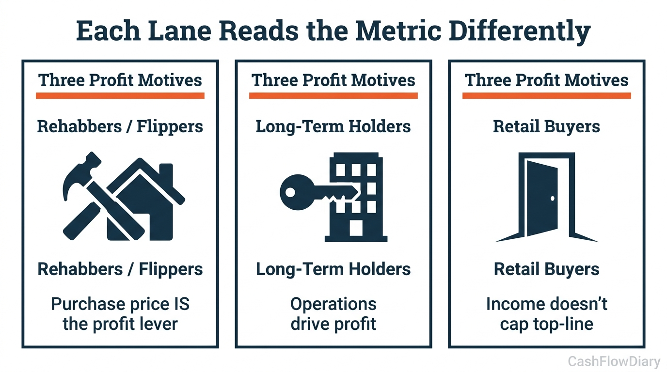
There are three lanes an investor can play in real estate, and each one reads this metric differently.
Rehabbers, fix-and-flip operators, and builders make money in lump sums off the purchase price. They buy a property, add value, and sell the whole thing. For them, purchase price IS the profit lever — every dollar negotiated off the acquisition price is a dollar of margin. Misaligned markets like Los Angeles or San Diego have a structural shortage of entry-priced homes, which means rehab inventory is harder to source — but successful flips command premium exit prices. The alignment score tells these operators where the gap is. They have to pair it with ARV (after-repair value) models, rehab cost per square foot, and days-on-market data segmented by price tier.
Long-term holders and operators make money off the operations of the property, not the acquisition. Purchase price is a factor in their underwriting, but it is not the profit motive. For them, the alignment score has an inverted read: low-alignment markets indicate where buyer demand is being displaced into the rental market because people who would otherwise buy cannot access the inventory. That is rental demand pressure compounding at specific price points. Operators pair the score with cap rate, rent-to-price ratio, rent growth, and occupancy data. The score tells them where to look, not what to buy.
"No one should spend the maximum dollar amount."
— J. Massey · CashFlowDiary
Retail buyers are looking for a home to live in. Their top-line number is not constrained directly by income in the same way an operator's is — they can stretch with co-signers, family help, or future-income assumptions. So they typically can pay the most for any given property under standard conditions. The alignment score gives them a macro affordability picture, but it does not drive their personal decision math.
As Nadia Evangelou, Principal Economist and Director of Real Estate Research at the National Association of REALTORS®, observed in the report:
""Too much of the inventory available today remains concentrated at higher price points, leaving a shortage of options for entry-level and middle-income buyers. This is preventing home sales from reaching pre-pandemic levels.""
That is the supply read from the buyer's chair. The investor read of the same data inverts it: a structural shortage at the entry-and-middle tiers is a structural surplus of rental demand. Buyers who cannot buy at those price points still need a place to live — and they will pay rent that lets a long-term holder underwrite to a cap rate the alignment score never explicitly shows.
How to Use the Metric Without Letting It Use You
The score is income-distribution anchored, which means it shifts when household incomes shift. It also shifts when interest rates shift — your income can stay the same while rates spike, and the score moves underneath you because the per-tier affordability threshold drops. That is a contextual factor most coverage of this metric is going to ignore, and it is the one that matters most for real estate investors operating with debt.
There is also a baked-in advocacy framing to be aware of. NAR's report calculates that the U.S. needs about 311,000 more homes priced under $261,000 to reach a balanced national market. That is a pro-builder, pro-policy advocacy frame embedded in the metric. NAR is a trade association with policy positions; it is not a neutral observer. The metric has real analytical value, but consider who produced it before accepting its prescriptions wholesale.
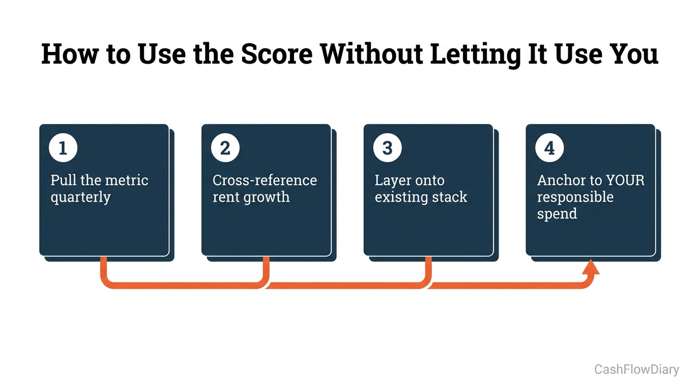
Here is how to use the score in actual underwriting:
1. Pull the metric for your target market on a recurring cadence. NAR refreshes the report periodically. Compare your market's score against the national 74.9% baseline and against its own 12-month and 24-month trend lines. Direction matters more than absolute level.
2. Cross-reference with rent growth. Markets where alignment drops while rent growth accelerates are signaling compressed rental demand — buyer-side capital is being displaced into your operating market. That is a green flag for long-term holders, a more cautious read for fix-and-flip operators.
3. Layer it on top of your existing underwriting stack — do not replace anything. The score is one signal among many. It does not replace cap rate, rent-to-price ratio, population growth, employment data, or local regulatory analysis. It adds a useful read on where supply-demand mismatch is creating tension at specific price points.
4. Anchor to your responsible spend, not the metric's maximum. This is the most important rule. The score tells you what households in a market could theoretically afford under standard assumptions (30% of income, 30-year fixed, variable down payment). It is not a recommendation. It is not a personal financial plan. No one should spend the maximum dollar amount the affordability math allows.
As Danielle Hale, Chief Economist at Realtor.com, noted in the same report:
""Until the supply of entry-level and middle-market homes grows to meet demand, many buyers will continue to find the market out of reach despite headline improvements in affordability and inventory.""
Hale is framing this for buyers. The investor translation: the supply gap at entry-and-middle price points is structural, not cyclical, and it is not going to clear quickly. That is a sustained tailwind for buy-and-hold operators who can underwrite to long-term rental cash flow. It is a more cautious signal for fix-and-flip operators in markets where entry-price inventory is structurally thin.
The metric is a contextual signal that becomes useful when you know what you are looking at. It is not traffic-light-simple. Most of the time, what we want from a data point is a binary read — green or red, buy or pass. This metric is not that. It is a frame for the question you ask next.
FAQ
What is the Listing-Income Alignment Score?
It is a single percentage between 0 and roughly 200% that measures how well the price distribution of homes for sale in a given market matches the income distribution of households who live there. A score of 100% indicates perfect alignment — for every income tier, listings are proportionally available to the households at that tier. Scores below 100% indicate the market is skewed toward higher price points relative to local incomes. The national score sits at 74.9% as of March 2026, per the NAR/Realtor.com Housing Mismatch Report.
What does the NAR Listing-Income Alignment Score mean for real estate investors?
It depends on which of three lanes you operate in. Rehabbers and fix-and-flip operators read low-alignment markets as a signal that entry-priced inventory is scarce — harder to source deals, but premium exits. Long-term holders read low-alignment markets as a signal of compressed rental demand — buyers who cannot buy still need housing, which supports rents. Retail buyers read it as a macro affordability indicator that does not drive their personal decision math. Across all three lanes, the score is contextual — it does not tell you yes or no on any specific property.
Which cities have the lowest listing-income alignment scores in 2026?
The five least-aligned metros as of March 2026 are Los Angeles (39.4%), San Diego (45%), Oxnard, California (46.8%), Providence, Rhode Island (50.5%), and Boise City, Idaho (53.2%). These are markets with severe shortages of inventory at most income levels relative to who actually lives there. Conversely, the most-aligned metros are Toledo, Ohio (107.4%), St. Louis (106%), Akron, Ohio (105%), Pittsburgh (102.6%), and Detroit (102.4%) — markets where listings are proportionally distributed across income tiers or even oversupplied at affordable price points.
Is this metric actually new?
No. The 2026 release rebrands NAR's 2017 Realtors® Affordability Distribution Score, which used a 0-to-2 scale where 1.0 indicated balance. The new presentation multiplies the old score by 50 and converts it to a 0-to-100%+ percentage where 100% indicates balance. The underlying four-step methodology is identical. The 2022 Double Trouble of the Housing Market PDF contains the original methodology in full, including historical data going back to 2016.
Should I use this instead of cap rate or rent-to-price ratio?
No. It is a contextual signal that complements your existing underwriting stack — it does not replace any of it. Cap rate measures yield on a specific property. Rent-to-price ratio measures cash flow potential. The alignment score measures macro supply-demand tension across a market. Use all three together. The alignment score is most useful for market selection (where to look), not for individual deal underwriting (whether to buy).
Sources
• NAR Housing Mismatch Report (2026) — the May 20, 2026 release
• NAR/Realtor.com "The Double Trouble of the Housing Market" PDF (2022) — original four-step methodology in full
• Methodology: REALTORS® Affordability Distribution Curve and Score (2017) — the original 0-to-2 scale specification
• Methodology: NAR Housing Affordability Index (HAI) — the older median-income-only metric for comparison
• Real Estate News — Housing market still out of alignment despite affordability gains (Dave Gallagher, 2026-05-20) — source for both verified quotes
• NAR Magazine — Inventory Is Finally Rising, So Why Aren't Buyers Happier? — release coverage with metro tables
• NAR — Q&A With Economist Nadia Evangelou: Solving Housing's Shortfall — Evangelou's policy framing
• NAR/Realtor.com 2017 Original Announcement (PRNewswire) — the lineage proof
• Freddie Mac — The Decline in Relative Housing Affordability and the Impact on Homebuyer Search Behavior — rate-shift caveat support
• International Monetary Fund — Housing Affordability research — international comparative context
• San Francisco Fed — Housing Affordability and Housing Demand — demand-correlation support
• Arbor Realty Trust — Renters Now Represent 80% of Household Growth — rental demand pressure evidence
Want more investor-focused real-estate market analysis? Subscribe to the CashFlowDiary newsletter for weekly contrarian reads on the housing data everyone else is missing.